FEELING BLUE
VALUE AND MEANING
Blue has been used for art and decoration since ancient times. The semi-precious stone lapis lazuli, coming from mines in Afghanistan, was used in ancient Egypt for jewelry and ornament and later, in The Renaissance, to make the pigment ultramarine, the most expensive of all pigments. In the Middle Ages, cobalt blue was used to color the stained glass windows of cathedrals. Beginning in the 9th century, Chinese artists used cobalt to make fine blue and white porcelain. Blue dyes for clothing were made from woad in Europe and indigo in Asia and Africa. In 1828 a synthetic ultramarine pigment was developed, and synthetic blue dyes and pigments gradually replaced mineral pigments and vegetable dyes. Pierre-Auguste Renoir, Vincent van Gogh and other late 19th century painters used ultramarine and cobalt blue not just to depict nature, but to create moods and emotions. In the late 18th century and 19th century, blue became a popular color for military uniforms and police uniforms. In the 20th century, because blue was commonly associated with harmony, it was chosen as the color of the flags of the United Nations and the European Union. Toward the end of the 20th century, dark blue replaced dark grey as the most common color for business suits; surveys showed that blue was the color most associated with the masculine, just ahead of black, and was also the color most associated with intelligence, knowledge, calm and concentration.
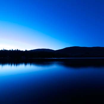
Surveys in the US and Europe show that blue is the color most commonly associated with harmony, faithfulness, confidence, distance, infinity, the imagination, cold, and sometimes with sadness. In US and European public opinion polls it is the most popular color, chosen by almost half of both men and women as their favorite color.
THE IMPRESSIONIST PAINTERS
The invention of new synthetic pigments in the 18th and 19th centuries considerably brightened and expanded the palette of painters. J.M.W. Turner experimented with the new cobalt blue, and of the twenty colors most used by the Impressionists, twelve were new and synthetic colors, including cobalt blue, ultramarine and cerulean blue.
Another important influence on painting in the 19th century was the theory of complementary colors, developed by the French chemist Michel Eugene Chevreul in 1828 and published in 1839. He demonstrated that placing complementary colors, such as blue and yellow-orange or ultramarine and yellow, next to each other heightened the intensity of each color "to the apogee of their tonality." In 1879 an American physicist, Ogden Rood, published a book charting the complementary colors of each color in the spectrum. This principle of painting was used by Claude Monet in his Impression – Sunrise – Fog (1872), where he put a vivid blue next to a bright orange sun, (1872) and in Régate à Argenteuil (1872), where he painted an orange sun against blue water. The colors brighten each other. Renoir used the same contrast of cobalt blue water and an orange sun in Canotage sur la Seine (1879–1880). Both Monet and Renoir liked to use pure colors, without any blending.
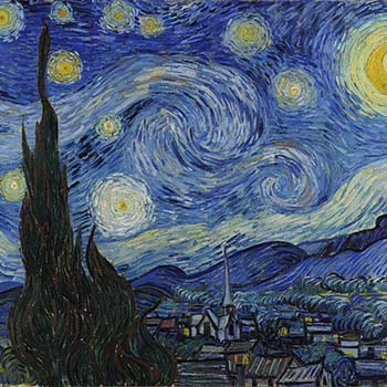
Monet and the impressionists were among the first to observe that shadows were full of color. In his La Gare Saint-Lazare, the grey smoke, vapor and dark shadows are actually composed of mixtures of bright pigment, including cobalt blue, cerulean blue, synthetic ultramarine, emerald green, Guillet green, chrome yellow, vermilion and ecarlate red. Blue was a favorite color of the impressionist painters, who used it not just to depict nature but to create moods, feelings and atmospheres. Cobalt blue, a pigment of cobalt oxide-aluminium oxide, was a favorite of Auguste Renoir and Vincent van Gogh. It was similar to smalt, a pigment used for centuries to make blue glass, but it was much improved by the French chemist Louis Jacques Thénard, who introduced it in 1802. It was very stable but extremely expensive. Van Gogh wrote to his brother Theo, "'Cobalt [blue] is a divine color and there is nothing so beautiful for putting atmosphere around things...”
Van Gogh described to his brother Theo how he composed a sky: "The dark blue sky is spotted with clouds of an even darker blue than the fundamental blue of intense cobalt, and others of a lighter blue, like the bluish white of the Milky Way ... the sea was very dark ultramarine, the shore a sort of violet and of light red as I see it, and on the dunes, a few bushes of Prussian blue."
IN THE 20TH AND 21ST CENTURY
In the 20th century, red was the color of Revolution; it was the color of the Bolshevik Revolution in 1917 and of the Chinese Revolution of 1949, and later of the Cultural Revolution. Red was the color of Communist Parties from Eastern Europe to Cuba to Vietnam.
In the late 19th and early 20th century, the German chemical industry invented two new synthetic red pigments: cadmium red, which was the color of natural vermilion, and mars red, which was a synthetic red ochre, the color of the very first natural red pigment.
The French painter Henri Matisse (1869–1954) was one of the first prominent painters to use the new cadmium red. He even tried, without success, to persuade the older and more traditional Renoir, his neighbor in the south of France, to switch from vermilion to cadmium red.
Matisse was also one of the first 20th-century artists to make color the central element of the painting, chosen to evoke emotions. "A certain blue penetrates your soul", he wrote. "A certain red affects your blood pressure." He also was familiar with the way that complementary colors, such as red and green, strengthened each other when they were placed next to each other. He wrote, "My choice of colors is not based on scientific theory; it is based on observation, upon feelings, upon the real nature of each experience ... I just try to find a color which corresponds to my feelings."
Later in the century, the American artist Mark Rothko (1903–1970) also used red, in even simpler form, in blocks of dark, somber color on large canvases, to inspire deep emotions. Rothko observed that color was "only an instrument;" his interest was "in expressing human emotions tragedy, ecstasy, doom, and so on."
Rothko also began using the new synthetic pigments, but not always with happy results. In 1962 he donated to Harvard University a series of large murals of the Passion of Christ whose predominant colors were dark pink and deep crimson. He mixed mostly traditional colors to make the pink and crimson; synthetic ultramarine, cerulean blue, and titanium white, but he also used two new organic reds, Naphtol and Lithol. The Naphtol did well, but the Lithol slowly changed color when exposed to light. Within five years the deep pinks and reds had begun to turn light blue, and by 1979 the paintings were ruined and had to be taken down.